All UI Elements
Your application's user interface is made out of elements. You can create custom elements with PBElementCreate or use the system provided elements. This document gives a list of all such elements.
Alerts
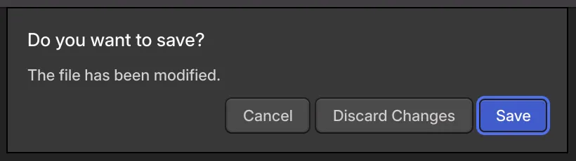
An alert displays a question or form to the user. Alerts are attached to the window that created them. The window is uninteractive while the alert is open.
To create an alert, see PBAlertCreate and PBAlertAddSimpleError.
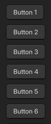
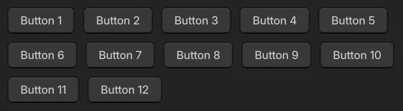
Buttons
Buttons are a rectangular region in which the user can click to perform an action. A text label is displayed indicating what the button will do when clicked.
To create a button, see PBButtonCreate.
Checkboxes
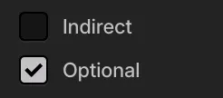
Checkboxes consist of a text label next to a box that may or may not contain a check mark. When clicked, the check mark will toggle on and off.
To create a checkbox, see PBCheckboxCreate.
Grids
Grids lay out their child elements into rows and columns. It is an advanced layout panel and is typically not necessary; most layout use cases are covered by layout columns and layout rows.
To create a grid, see PBGridCreate.
Image Displays
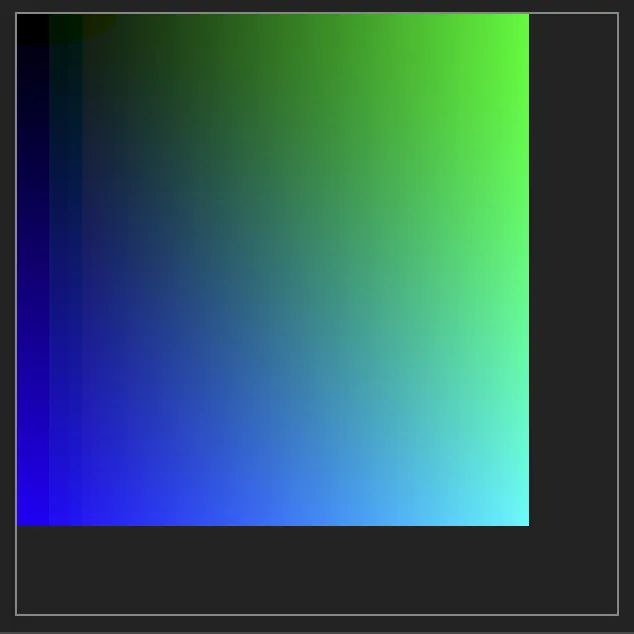
Image displays are used to display images (see PBImage) to the user.
To create an image display, see PBImageDisplayCreate.
Input Fields
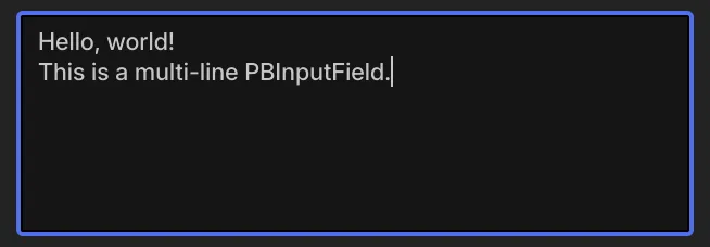
Input fields are used to let the user edit text. Single-line and multi-line variants are provided. They must be wrapped in a scroll view.
To create an input field, see PBInputFieldCreate and PBInputFieldCreateSingleLine.
Layout Columns
A layout column arranges its child elements in a vertical column, one after another. Individual child elements can be aligned to the left, center or right. Furthermore, individual child elements can be instructed to fill the remaining vertical space. A gap, vertical space between each child element, can be specified. Furthermore, a set of insets, space between each edge of the layout column and where the child elements are placed, can be specified.
To create a layout column, see PBLayoutColumnCreate.
Layout Rows

A layout row arranges its child elements in a horizontal row, one after another. Individual child elements can be aligned to the top, center or bottom. Furthermore, individual child elements can be instructed to fill the remaining horizontal space. A gap, horizontal space between each child element, can be specified. Furthermore, a set of insets, space between each edge of the layout row and where the child elements are placed, can be specified.
To create a layout row, see PBLayoutRowCreate.
Log Views
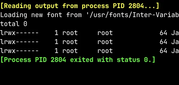
A log view displays a large amount of monospaced text quickly. Text can be efficiently added to its internal buffer. When the buffer is full, text from the start of the buffer is automatically removed. Each character can be colored individually. Text can be selected and copied. It must be wrapped in a scroll view.
To create a log view, see PBLogViewCreate.
Menus
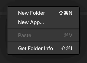
A menu displays a list of commands for the user to choose from. The menu is dismissed when a command is chosen or the user clicks outside the menu. Other windows are uninteractive while the menu is open. Menus can appear the mouse cursor's position or be placed in the application's menu bar.
To create a menu, see PBWindowPopUpMenu and PBWindowSetMenuBarItems.
Pop-Up Buttons
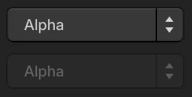
A pop-up button lets the user make a selection from a list of items. Only the selected item is displayed on the button itself. When the user clicks the button, the list will temporarily appear as a pop-up.
To create a pop-up button, see PBPopUpButtonCreate.
Progress Indicators
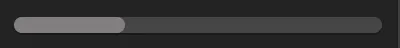
A progress indicator displays the fraction of an operation's completion. Or, it can be used in the "indeterminate" mode, to indicate an ongoing operation of unknown size.
To create a progress indicator, see PBProgressIndicatorCreate.
Radio Groups and Radio Buttons
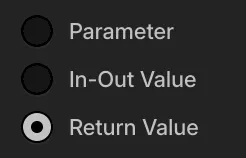
A radio group contains a set of radio buttons. Each radio button has a label. Exactly one button in any group is selected at a time. The user clicks a radio button to make it the selected one in the group.
To create a radio group, see PBRadioGroupCreate. To create a radio button, see PBRadioButtonCreate.
Resizable Panels
A resizable panel is made of a handle and some content. The user can drag on the handle on one axis to resize the content.
To create a resizable panel, see PBResizablePanelCreate.
Scroll Views
A scroll view lets content larger than the window be displayed. Scroll bars appear as necessary to let the user pan around the visible portion of content.
To create a scroll view, see PBScrollViewCreate.
Size Constraint Panels
A size constraint panel constrains its child element's size. When creating the size constraint panel, minimum and maximum widths and heights can be specified. Each constraint is optional. By setting the minimum and maximum values for an axis to be same, the element size is exactly specified on that axis.
To create a size constraint panel, see PBSizeConstraintPanelCreate.
Table Views
A table view displays a list of items. There may be multiple columns, each used to display a different piece of information about the items. Items can selected, dragged, edited and styled. Very large numbers of items are supported efficiently. Table views must be wrapped in a scroll view.
To create a table view, see PBTableViewCreate.
Text Displays
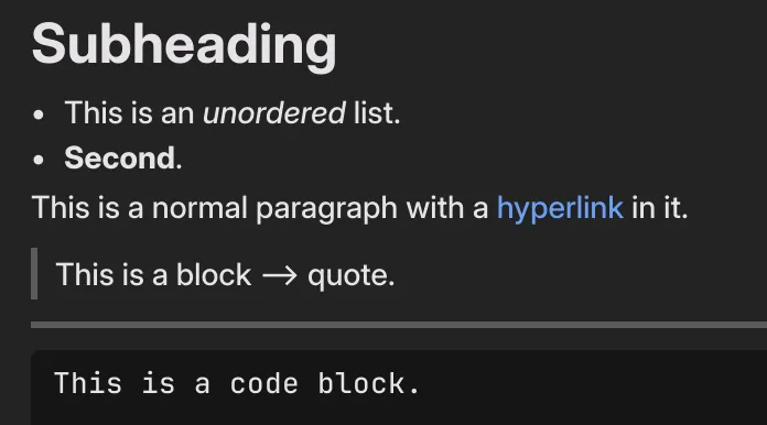
A text display is used to present textual content to the user. This could be a single line label, or a complex multi-paragraph document.
To create a text display, see PBTextDisplayCreate.
Toolbars
A toolbar displays a small number of commands at the top of a window for quick access.
To create a toolbar, see PBWindowSetToolbar.
Transition Panels
A transition panel is used to introduce or remove content with a transition effect.
To create a transition panel, see PBTransitionPanelCreate.
Virtual Text View
A virtual text view is a low-level control used to display large amounts of monospaced text quickly. It is highly flexible, although it does require some setup. It must be wrapped in a scroll view.
To create a virtual text view, see PBVirtualTextViewCreate.
Windows
A window contains a single instance of an application. It can contain any of the UI elements described on this page. Windows are typically created only in response to PBMsg_APP_CREATE messages.
To create a window, see PBWindowCreate.
Wrap Panels
Wrap panels lay out their child elements into rows or columns, fitting as many children into each until moving to the next. It is an advanced layout panel and is typically not necessary; most layout use cases are covered by layout columns and layout rows.
To create a wrap panel, see PBWrapPanelCreate.